Do you know the Emotions of Colors?
- Rajat Goel
- Mar 18, 2021
- 3 min read
Colors and emotions are closely linked. They can make us feel happy or sad, and they can make us feel hungry or relaxed. That’s why it’s important to understand the psychological effects and the meanings of colors.Come and let's know the emotions of colors & where we should use them..
1) Red:

Red is the warmest color. It is often associated with #passion and #love as well as #anger and #danger. Red speeds up our heart rate, blood flow, and body temperature.Red stimulates our senses of smell and tastes too.
If you want to draw attention to a design element, use red. But use it as an accent color in moderation as it can be overwhelming.
2) Orange:

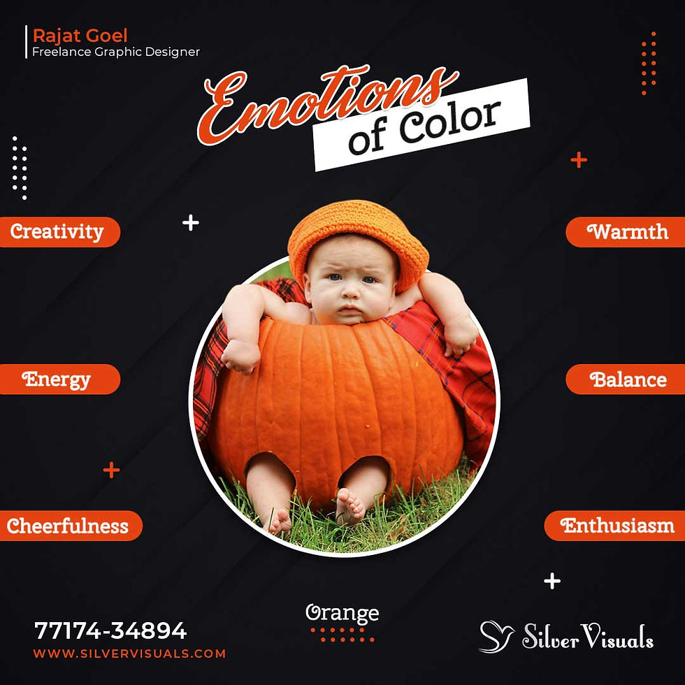
Orange is strongly associated with creativity. Orange makes you feel energized and enthusiastic.
In designs, orange commands attention without being as overpowering as red.It has the warmth of red and the optimism of yellow, and it communicates activity and
energy and encourages socialization.
Orange looks and feels fresh and healthy and can even stimulate appetite. And because it is very easy to see it is used to catch attention.
3) Yellow:

Yellow is the most visible and warm color of the spectrum.The human eye processes yellow first. This explains why it is used for cautionary signs and emergency rescue vehicles.
It is associated with laughter, hope and sunshine.It stimulates our nerves, glands and brain, making us more alert and energized. It boosts our memory, and it encourages communication. It’s a color that promotes activity and interaction.
Accents of It help give your design energy and will make the viewer feel optimistic and cheerful.Too much yellow can be overwhelming and should be used sparingly. Use it for grabbing attention in comforting way.
4) Green:

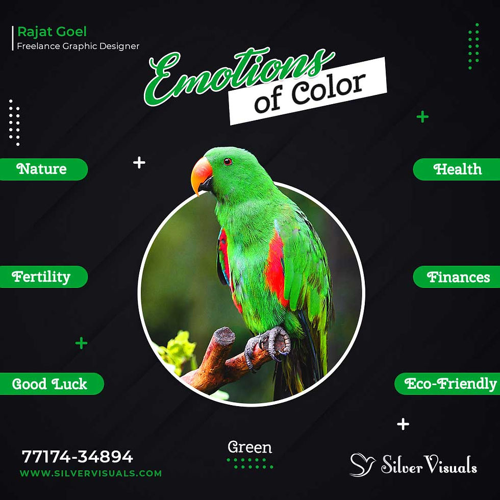
Green is a very down-to-earth color. It can represent new beginnings and growth🌱. It also signifies renewal and abundance. Alternatively, green can also represent envy or jealousy, and a lack of experience.
In design, It is the easiest on the eyes 👀 and should be used to relax 😌 and create balance ⚖ & harmony, and is very stable.It’s appropriate for designs related to 💰wealth, stability, renewal, and 🌴🌴nature.Green can also feel 😌calming and relaxing.
Brighter greens are more energizing and vibrant.
Olive greens are more representative of the natural world.🌍
Dark greens are the most stable and representative of affluence.
5) Blue:

Blue is associated with peaceful rest, profound insight, and spiritual realization 🕉.Seeing the color blue causes the body to create chemicals that are 😌calming.
Bright blue: Cleanliness, Strength, Dependability, Coolness, Energizing and Refreshing.
Light (sky) blue: Peace 🕊,Serenity, Ethereal, Spiritual 🕉, Infinity, Refreshing and Friendly.
Dark blue: It is the most commonly used color in corporate identity.Dark blues are more 💪 strong and reliable.
Like navy, are excellent for corporate sites or designs where strength and reliability are important.But using too much can create a ⛄cold, disengaged feeling.
6) Purple:

Purple & Violet is mixture of blue and red color.
PURPLE = Blue + MORE RED
VIOLET = MORE BLUE + Red
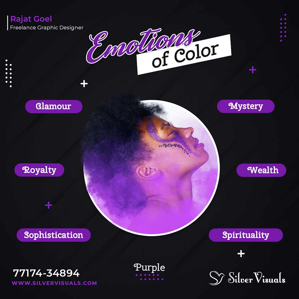
Purple is associated with mystery, creativity, royalty and wealth. Incorporate purple to make a design look more luxurious and wealthy or a lighter purple to show romance and mystery.
Darker shades often represent luxury or opulence, while lighter shades are quite feminine, sentimental, and even nostalgic.Lighter shades of purple are often used to soothe or calm a viewer, hence why it is used in beauty products.
It works with blues, greens, oranges, and its complementary color is yellow, but it also combines well with other shades and tones of purple.
Follow us on Instagram for more updates & design tips. Like, comment or share with friends, if you like & learned something today. Thank you!


Comments